Making Sweet Darkness

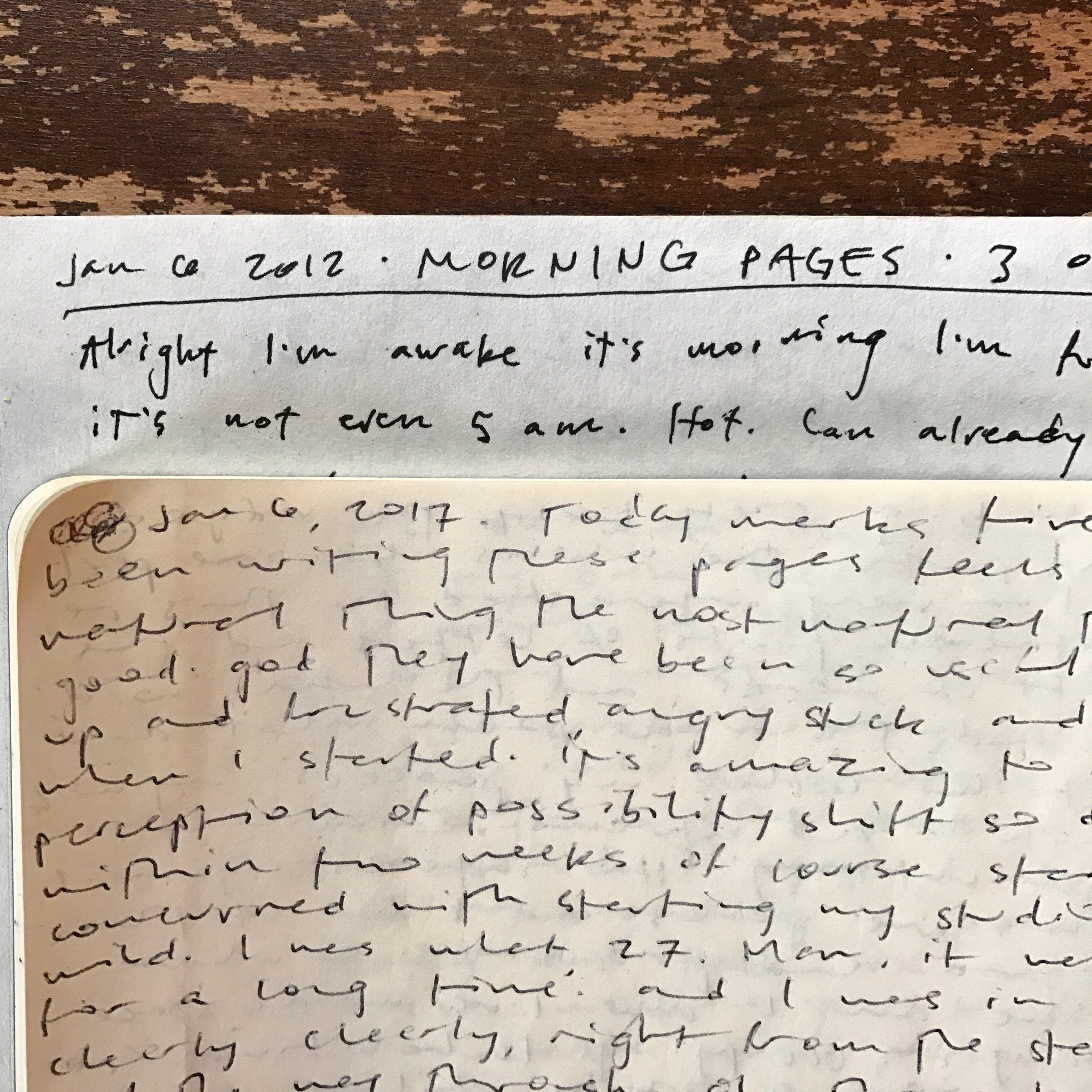
I first read the poem “Sweet Darkness” by David Whyte on a Friday, at the end of one of the worst weeks of my life. Husband demanding separation, step daughter screaming, mother gone missing. With rain and wind and a million shouting voices of need all around, I got to those last three lines and the bottom fell out. It was a sucker punch to the gut, aimed straight at all the things I already knew and didn’t want to.
“anything or anyone
that does not bring you alive
is too small for you.”
In the ensuing two and half years, I’ve broken free from many too-small things. I’m divorced. I’m no longer parenting, but the kid and I have patched together new ways to relate and the strain eases each month. My mom returned, forever changed, not for the worse. Many shreds of pretending have fallen by the wayside in all of my relationships, and they are the better for it. I don’t feel like I have any answers. I no longer know many things I used to. And I sure as hell don’t take my loved ones for granted.
Evolution of a print
As I began to accept the “sweet confinement of [my] aloneness” that the poem so beautifully describes, I looked for context. I got a copy of The House of Belonging and read the whole collection a few times. I inquired about copyright permissions, but wasn’t yet ready to produce the piece. Time passed. I published a second book, acquired the press I needed to do large format work, drove to New York and back and flew to Italy, printing all the way. I returned home happily to a summer full of backpacking and press restoration.

All the while, the poem was with me and the image of it on the page slowly took shape. I printed my first piece on the Colt’s (new press) in October, and knew I had the tools I needed to execute what I was imagining for “Sweet Darkness.” While working in Chicago this past November, I debated logistics and composed the bones of the project in my mind, to flesh out upon my return. Then the US general election happened. Another bottom fell out, hard and fast and crash landing into a world full of hate. In the bleary early morning hubbub of multiple delays at the O’Hare airport, I wrote up a proposal and sent it off to David Whyte before boarding my plane home.

With a positive response and details quickly agreed upon, I ordered materials and set about designing. I had a strong image of the word Darkness carrying much of the structure of the print. Lacking large wood type in my shop, I knew I’d have to do a linocut in order to get the size I wanted. But how to communicate the design in process?
When I work with a poet for the first time, there’s this beautiful unnerving tension where I have no idea how they are going to react to my typographic treatment of their words. As my work tends more and more toward the abstract, this tension rises and the risk of sharing my ideas heightens. While my eye is well trained and I have a decade of experience with type now, all my work comes back to a highly personal connotation with the text, which I read over and over throughout the design process. This grounding in the text is what gives me the courage to present my work to authors.

Analog to digital and back again
Carving is a big commitment, and so I did something I’d never done before with this broadside—a full digital mockup. This lead to new experimentation that I’d not have engaged in otherwise. Since I wanted to work from my type collection, I set Darkness in metal type (Venus medium), proofed it, scanned it in and opened it in a digital design program where I enlarged the letters and manipulated the spacing between them.

The text of the poem was easier. I knew I wanted to work with it in a straightforward fashion with Perpetua, my house serif. From the first mockups, the heavy abstraction of the word Darkness created an exciting tension with the delicate precision of the poem and the ample white space I built around it. The problem, as it turns out, was the word Sweet. I tried treatment after treatment, each one missing something I couldn’t put my finger on. David and Julie and I traded several rounds of proofs and while we all agreed it wasn’t quite right, ‘sweet’ refused to settle itself.
I knew I’d find the answer on press. With a big gulp and clear intuition that it was time to leave the digital realm and get back to my hands, I set about carving the linoleum block and handset the poem in metal type. I printed the first run, Darkness, in wildly slow fashion, as I had to add ink every 8 impressions to keep the desired opacity over that much surface area. I had some issues with low spots in the block, and experimented with minute changes in impression and ink levels before settling on the level of ‘saltiness’ or distress to maintain.

First run done, Colt’s Armory Press ready and waiting for the next!
Refining sweet
With Darkness printed and the poem ready to go, still Sweet eluded me. I set and proofed it in ten different typefaces, on clear mylar so I could try out as many layout possibilities as I could imagine. Too many details collided and my reasoning blurred.

I did what I always do when faced with a particularly difficult design problem. I set aside the print and proofs for a couple days, and I reread the poem twenty times or so. I read it quietly, I read it out loud, I read it in my shop, I read it at home, I read it on the ferry. I closed my eyes and allowed myself to feel what I felt. And the darkness was its own comfort, and in that comforted space I realized the word Sweet should be black, integrated right into the Darkness the poem weaves it with. Hence, black on black.

In the end, I printed the word Sweet all by itself, in a third and final pass. The secret to making the black on black print work was twofold: one, it worked because I had decided to run the linocut with some saltiness in the print, and two, I mixed in some metallic purple ink to the black. The purple experiment resulted from a discussion with my friend Andrew Steeves at Gaspereau Press, who explained that the difference in tone would draw the word out from the background black. And my was he right!

I also printed Sweet with a slightly heavier impression, so while the tone is drawing it out, it sits deeper in the paper. These subtle manipulations of ink, paper, and impression are what make up the invisible work of letterpress printing. Many hours are dedicated to tiny changes that aren’t visible to the casual observer, but any viewer can feel the depth they lend to the overall piece. The exploration of these details is what keeps me printing day after day. I delight in learning to see subtler variations in form and materials and their effect.
Further unseen excitement
Speaking of, after all was said and done with this print, another delightfully specific typographic detail was brought to my attention. Type designer Matthew Carter pointed out a few half-point irregularities in the spacing of the lower case o’s in my 18pt Perpetua. After much typecase spelunking and back and forth consultation, I discovered a whole new level of precision that is available to me in setting this particular type. Goes to show, you can’t see what you can’t see, and what a thrill when someone shares their more practiced eye! Always ask, always listen.

The final print, signed and ready to ship! 11×17; available here.
It was a real pleasure to work with David Whyte and the crew at Many Rivers Company in producing this print. They were kind, gracious, expedient, and wonderful to get to know. I’m honored that David was open to my design approach, and our collaboration pushed my work forward in a deeply useful way. Now these words are up on walls around the world and here at home, a bold and sweet reminder of all that we already know and have only to accept.