Scraps of Red

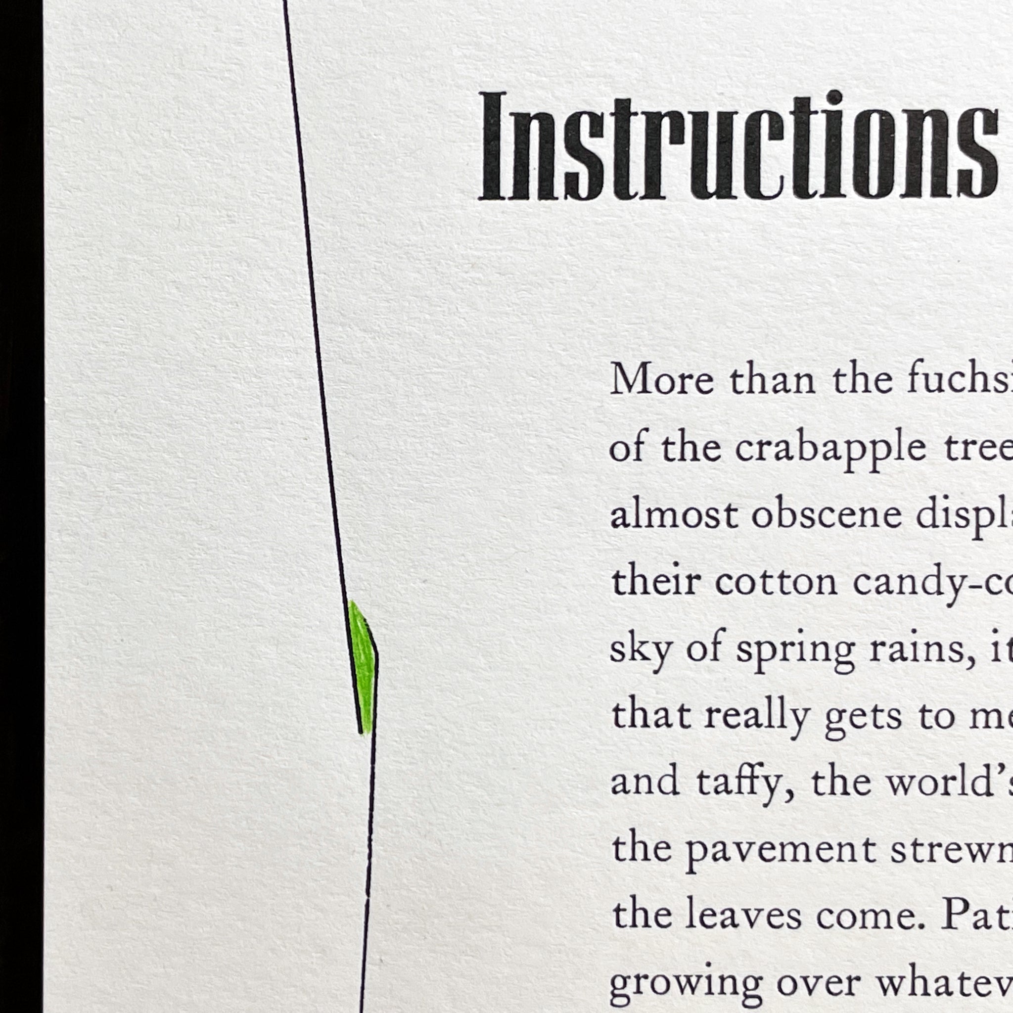
First pass for the title printing on ‘3 Blazes.’ Globe Gothic Condensed.
I love the challenge of color – and believe me, it’s almost always a challenge. In fact, many printers will attest that only three colors exist: black, red, and the white of the paper. What letterpress printer doesn’t love constraints?
My favorite color to print is black. But often, something more is needed. Illumination, embellishment, a calling-out if you will. When the question of a second color arises, red is always my first consideration. If it’s been working for the craft for the last 500 years, surely it will continue to work now. Especially when it comes to literary prints. There is nothing quite like crisp black ink on white paper with a red accent.
I’m always printing from scraps of ink when it comes to color. In fact, I work with all kinds of scraps. Most of my work to date has been printed on paper offcuts from the nearly bottomless supply I inherited from Stern & Faye, Printers. I love to use and reuse, and why not throw in another constraint, this time limiting the dimensions and edition size? I like to let the materials limit my decision-making process as much as possible. It’s a survival tactic, really. And a way to move forward. This way I can focus all my decisive energy on the type itself.
Alongside all those cans of ink from Stern & Faye, I inherited another ink resource arguably more valuable, especially for someone as color-inhibited as I am. And that is the scraps of ink leftover from every job and piece of art printed at the legendary Print Farm. Six A4 envelope boxes, sorted by color, each brimming with little foil packages doused with daubs of sample ink and notes on the formula. Jules was going to toss them out – cause who needs ’em, really – when you can just mix up any color you want with brand new ink. And of course I do mix all kinds of colors. My ink mixing station is now replete with its own growing pile of foiled scraps.
For me, these scraps are priceless. When I need a color, instead of thumbing through my Pantone formula guide, I first pull out the box labeled ‘grey’ or ‘blue’ or ‘green’ and paw through these well-known bits of possibility. I love to use them. So when ‘3 Blazes’ needed a second color, that’s just what I did. No question which box I was going for.
Digging through ‘red,’ I pulled out a little package mixed and wrapped by Chris or Jules who knows how many years ago. I peeled it open to reveal a stunning bright red, fresh as the day it was first mixed. I scraped it out and loosened it up on the mixing glass, turning it over a few times with the knife. One proof showed it was perfect.
But was there enough to last the entire edition? No worries. The edition size wasn’t yet set – so it could end when the red ran out.