On tenderness & typos: making “Love” by Jamaica Baldwin

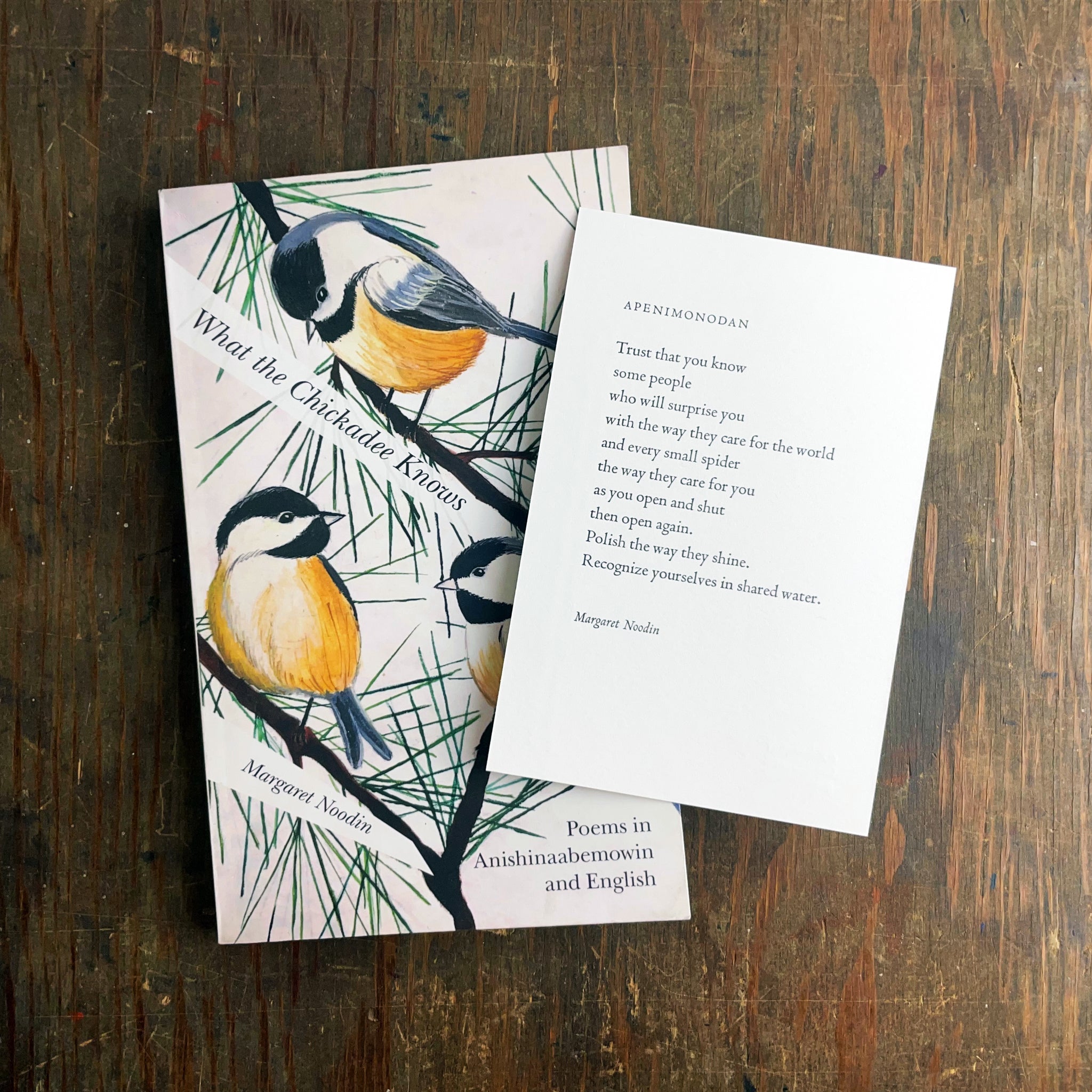
Love
If not the word, then the stillness.
Let us linger here awhile.
If not the song, then the brushstroke.
Gentle. I am tender-headed.
This is how to love me,
with your hand holding the pain off at the root.
Jamaica Baldwin
//
When I first read this poem I loved it up till the last line and then I hated it. Well, maybe not hate but I was left with a strong distaste. I did not like it at all. But did I print it? Why yes, I did. Because I have learned over the years that any strong feeling I have in response to a poem is useful. That it means there's something for me to learn. To realize. To uncover, often internally, and that is useful indeed. It's why I keep reading poetry.
I met Jamaica some years back when we released the Poem about My Rights broadside. She graciously agreed to read at our event honoring June Jordan at Open Books here in Seattle. Later, I was excited to learn about Jamaica's forthcoming collection Bone Language from YesYes Books and when she asked after collaborating on a piece to help promote it, the answer was an easy yes. Jamaica is a great poet and lovely to work with.
Expansive conversation, difficulty selecting
It's always a thrill to get to read a manuscript before publication, and such an honor. I poured over the poems a few times and struggled with making a selection because there were many great possibilities, both full poems and excerpts that I could imagine printed. Those possibilities only expanded in conversation with Jamaica. We hemmed and hawed while she continued to make final refinements to her manuscript as it was being ushered through the book production process.

In the end, Jamaica called it and I couldn’t deny: "Love" was a perfect pick for our project. Format-wise, tone-wise, language-wise. It stands alone while holding the complexities that wrap through the heart of her book. And it holds them in a scant six lines with great tenderness and no simplification.
Once we had the poem, the design came together simply. Caslon for the type — sturdy, reliable, forgiving, with small caps and italics to help offset the poem title and author's name while keeping everything snug on its tiny page of our 4x6" notecard format. There was one major hiccup in the production process though!
Hard deadline, major hiccup
We were working against a hard deadline, shared by several other prints in various states of production: AWP, an annual conference for writers and writing programs in the US with a big book fair attached. It's a major event for authors and publishers alike, where new books are often showcased. Jamaica's book was set to be released that week and we wanted the notecards ready to accompany it. That became even more important when YesYes pushed back the publication date, making our prints the only tangible handout for the conference.

Jamaica at Expedition's booth, pointing out her name in our author display at AWP 2023.
Our presses were running every day the last couple weeks leading up to AWP that year (and we were packaging prints and designing and packing our booth simultaneously). I printed all the credit lines for the new notecards one after the other, Jamaica's included, and then dialed in the forms for the front of each one by one. "Love" came up at the end, and I was so happy printing it, exhausted but satisfied, treadling away on our Golding Jobber, handfeeding and delivering each finished print to the clink-clink-rattle rhythm of the ink disc's rotation.
I was about 400 prints into the run of 600 when I suddenly noticed the words "brush stroke" at the end of the third line. I had seen them of course a few hundred times already but that's the thing about the repetition of printing: it lets you keep looking. Sometimes when my brain's focused elsewhere (operating the press, handling the paper, monitoring ink levels) it allows things I hadn't seen, that are right in front of me, to come into view. Like an extra space between two words that should be one.
Gripped by panic, I stopped the press and rushed over to our shop dictionary in a cold sweat. Looked it up. Then again online. Then again in the book. Yes, yes. "Brushstroke" is indeed a compound word. I texted Jamaica to confirm, which she did, and thanked me for catching it — it was wrong in the manuscript as well. This is one of the challenges of working with unpublished poems: you don't have the professional copyeditor's work embedded in the text yet. A good reminder always of why that oft-ignored work is so vital! No matter how good the poet or how sharp the printer's eye, it takes many, many professionals to shape a book to its final form sans errors.

Integrity is everything here at Expedition Press. When there's a typo, we fix it. No matter what. Because in poetry, every word, every line break, every bit of space has been deeply considered by the writer before it ever reaches our hands. So no matter who missed it, we fix it!
When it's in service to the poem, it's worth it
Being in any kind of rush makes you prone to more error. So I sat down. Took some deep breaths. And walked away from the press. I left it fully inked and went outside. Got some coffee and chatted with the baristas next door and then re-entered my inky, paper-strewn shop full of half-packed boxes and wet prints layered multi-deep on every possible surface. I walked up to the press, pulled out the form, unlocked it, picked up my tweezers and pulled out that slim single piece of 5em spacing material between "brush" and "stroke." Plopped it in at the end of the line to keep it tight. Then I locked the form back up, put it back in the press, and pulled a new proof.
Ah, at once I was soothed! And was affirmed, as always, that making something even a tiny bit better, when it's in service to the poem, is worth it. I sent a picture of the proof to Jamaica and she gave it a thumbs up. And then I proceeded to scrap the entire run of finished, mis-printed notecards. Into the recycling bin they went. I cut down a fresh ream of our house stock and started again, from the beginning, now with that one bit of space in its correct place — unseen, at the end of the line instead of dividing "brushstroke."
Beautiful & uncomfortable
I’ve lived with this poem about six months now, through many readings, lots of feeling, deep calls with the poet, letter by letter typesetting, and typographic detail-tending. That timeframe happens to coincide with a major life change: I moved in with my partner after seven years of living alone. I realize now that I didn’t like that last line when I first read it because it’s true. For me personally. It’s hard to love and be loved. Sometimes it even hurts. It means being seen, and witnessing, ever more intimately. Which is beautiful and uncomfortable. I’m grateful I get to live with a person I love and I’m grateful to have this poem to help me.
Wishing you much love, down to all your roots.

//
About Jamaica Baldwin
Jamaica Baldwin is a poet and educator. Her accolades include a 2023 Pushcart Prize, a National Endowment for the Arts Fellowship, a RHINO Poetry editor's prize, a Glenna Luschei Prairie Schooner Award, as well as the San Miguel de Allende Writer's Conference Contest Poetry Award. Jamaica has also served as a community based teaching artist with Writers in the Schools - Seattle, Louder Than a Bomb - Great Plains (an affiliate of Nebraska Writers Collective), and taught a generative writing workshop for women in Guatemala. She is currently an Assistant Professor in the Department of Writing at Ithaca College in New York. Learn more on her website here.
//
Links
Get the book here: Bone Language and the print here: Love.