Design Process with Metal Type

Making notes on one of the many proofs for ‘prop cards’ I printed this week.
People often gawk when I give a typesetting demo, sliding each metal letter one by one into the composing stick, tilted at an angle to keep them in line, upside down and backwards. It’s a perfectly natural process to me, and the less I think the quicker I can set. This is how I first learned to work with letterforms and practice typography, the arrangement of text on a page. It’s much more awkward for me to sit in front of a blank screen and try to conjure up a beautiful design amidst endless pixels. I like the cool hard physicality of metal type, the unforgiving edges, the straightforward constraints of what you have on hand. The first obvious limitation is the choice of typefaces (the style of the type, how it looks). The second, and perhaps the one that I have to work around most often, is size. I’ve got a wide array of type and several good runs of both book and display faces, but I can’t shrink or grow any of the letters. They are the size that they are.

I’m often queried about the amount of time it must take to set a block of text, letter by letter. Truth is not much time at all. In fact, I don’t actually work with the letterforms much in themselves. I think a lot about their style and shape at first, and pull out bits of this and that, set lines and words in several faces when I’m coming up with an initial concept. Sometimes I get to proofing and it’s not right, and I redistribute everything and start again. But the real time suck, the place I get stuck or lost or embedded for hours on end, is the arrangement of space.

In any composition, there is positive space and negative space. It’s pretty obvious which is which when you’ve got black marks on a white page. And if you’re reading the black (composed of letters of course, in my line of work), you probably don’t think about the white space much. Because, well, nothing’s there. All careful typesetting, whether in metal, wood, plastic, pixels, etc, requires careful treatment of spacing. The difference between the analog and the digital media is that when you’re setting metal type, you also have to physically set all of the spacing in place. Alongside the type, there’s a huge assortment of ‘spacing material,’ small metal pieces that are precision cut to varying thicknesses, all in relation to the point size of the type (10 pt, 12pt, 18pt, etc). They are lower than the height of the type so they don’t get inked, and hence don’t show up in the print.

For any given design, I pull the concept together quickly by test setting a few lines in a few different faces while honing in on the sheet size, kind of paper, desired outcome (what’s the point? what is this print’s job out in the world?). I’ll pull a few rough proofs, often on mylar (acetate, clear plastic) and figure out the basic layout on the page. Then I fully set the form, lock it in, ink up the press, and make gross adjustments for impression and basic registration.

Then comes the time warp. At this point, I will often spend a whole afternoon, sometimes whole days/nights/weekends moving bits of spacing material in and around letters, words, and lines. With tweezers in hand and a thousand pieces of metal that vary in thickness point by point, I arrange space. I will often make half-point adjustments one at a time, pulling proofs between each one. I’m always trying to see something I haven’t seen before. One useful trick is to overprint proofs upside down. This gives a lot of information about the balance of the composition, and more often than not delights me with strange and interesting overlaps. When something occurs to me that may be better, I go ahead and reset it, proof again, set, plane, lock, proof, step back, consider. Repeat. If I think of another possibility (which I generally do), I have to try it and see. I can only hold so much of the vision in my mind at a time and no matter what I imagine, as Clifford Burke puts it in Printing Poetry:
The only standard is appearance.
This resonates deeply with me because I always have to see ideas outside of my mind and in my hands in order to make tough design decisions. I spend a lot of time looking at and adjusting the apparent space between letters. Though they are uniformly cast on their bodies of lead, they each have their own shape and occupy their allotted square or rectangular space differently. There are two main activities here: kerning, or adjusting the space between two letters, and letterspacing, or adjusting overall spacing within a grouping of letters. Adding space is easy enough but taking it away is a major commitment when you’re working in metal. You either need a type saw, or very steady hands and patience enough for a file, or keen eyes and luck in the typecase. Sometimes you can find sorts, or characters, that have already been partially sawn for kerning. One likely candidate is the uppercase W, which leaves an unsightly gap without kerning when followed by a lowercase vowel, for instance.

Ensuing mess on the imposing stone mid-design process.
I recently had the pleasure of discussing some of these details with British type designer Matthew Carter, and he brought up Charles Eames’ sentiment that “he was conscious of working within constraints but not of accepting compromises.” I love working within constraints, in fact I actively look for them and impose them in my fine art projects as well, as a way to focus, and to get started. Constraints help me clarify what I’m doing, and why. In our day of information overload, I am routinely paralyzed by the tyranny of choice in any given grocery store aisle, paint chip display, google search result. I retreat to my cabinets and cases of type, consider the options drawer by drawer, set the letters one by one, and arrange the space bit by bit. I work to create as much space as possible, and arrange it as well as possible, so that people can see what has been said, take their own time to reflect upon it, and discover what they think and how they feel about the words at hand.

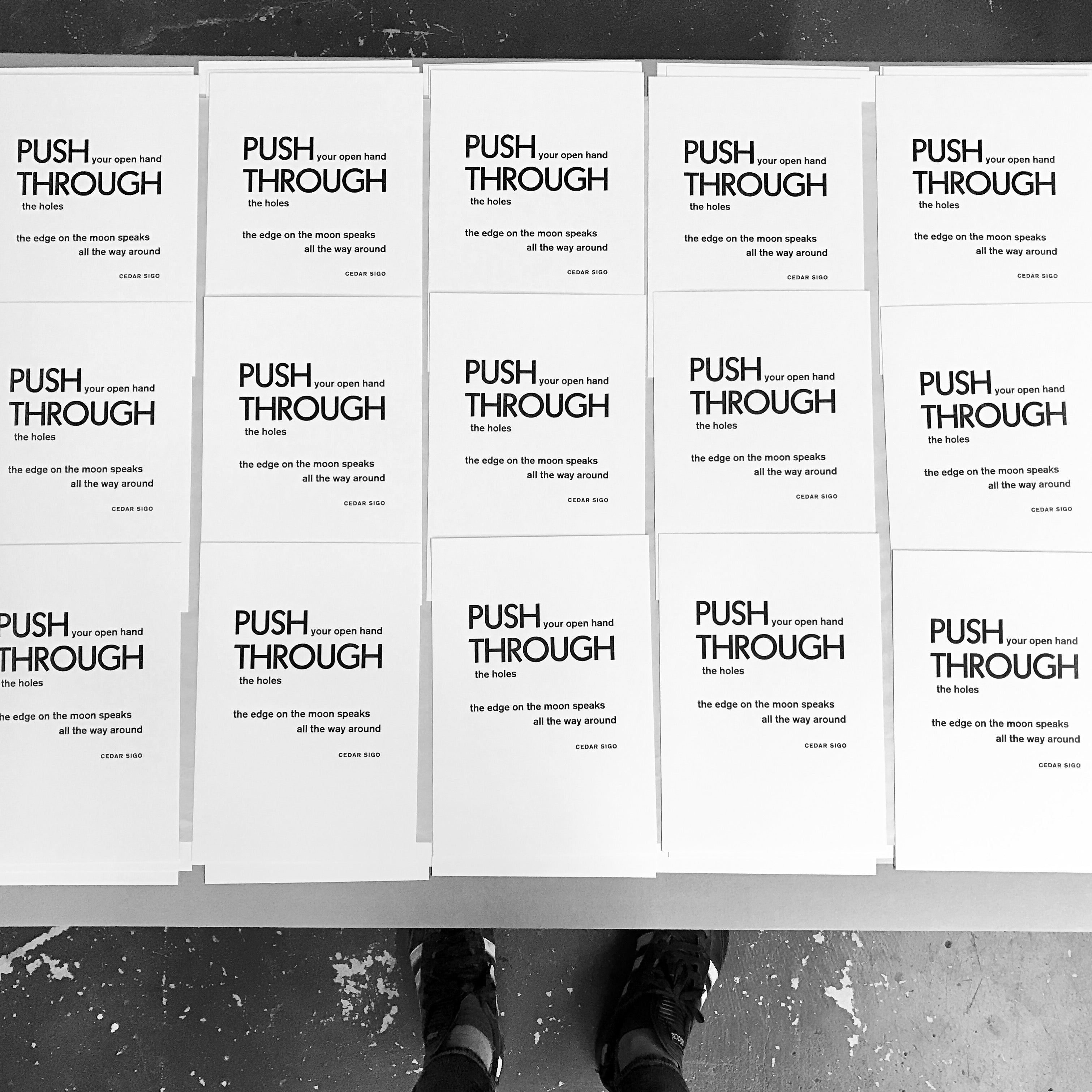
End result: ‘prop cards’ required to formalize my membership in the Amalgamated Printers’ Association (APA).