How to Publish a Poetry Book

When it comes to publishing, I have only one criteria: I must love the poems.
No one recommended this rule, I haven’t read any books or blogs about how to make it in the publishing world, and I didn’t even write any lists or think twice. Like with all major life decisions (i.e. going to college, moving cross-country, getting married, becoming a parent, publishing a book…), I’ve always known that so long as I love something, I can make something beautiful from it. And things that are loved and beautiful are the most useful kind of things, so I’m sticking to my guns.
Today is three weeks until the official release of my newest publication, Passings, a book of poems about extinct birds by Holly J. Hughes. I know that by March 24th a real book will exist that I can sell and ship and share with people, but from where I’m sitting now it still seems like magic is required – some kind of hocus pocus, surely – to pull it off. All of the major decisions have been made. The materials are ordered, the covers are printed, the interior is finalized and being printed now. All of the dimensions are set. All 427 pieces of Irish linen bookbinding thread are cut and waxed thanks to my awesome intern Bridget. More than half of the covers for the trade edition are even folded.

And yet. I can’t shake this feeling, how is it that the books are actually going to exist? It’s sheer magic, publishing. Something from nothing, something from everything. It’s a long road to travel between a manuscript created in Microsoft Word with Papyrus titling to a book that the Seattle Public Libraries will put on their shelves. I’m honored to have been entrusted with building a home for this set of poems, and I am excited to send them out to live in the world in homes far and wide.
The Process
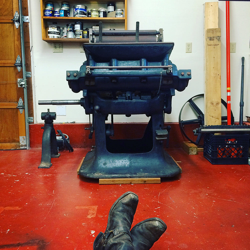
A friend aptly dubbed my process ‘turn of two centuries publishing.’ I blend old and new technologies in ways that are not always efficient, but make the most sense to my hands and eyes. I use the latest version of Adobe Creative Cloud alongside antique presses built in the early 1900s. As an artist, I experiment ceaselessly and want to push the boundaries the furthest; as a publisher, I want to make something sturdy and accessible that honors the text in its own beautiful space. I believe that words need space to breathe well on a page, just as we humans need time to breathe well when we’re reading. The first step to any publishing project is the arrival of the text.
In the case of Passings, it arrived to me on a sunny spring day on a slow walk in my hometown. I ran into longtime neighbors and we fell in step and traded stories, many literary. I look up to Holly and John on many fronts. They have dedicated their lives to working with words in the roles of editor, poet, publisher, and professor. I sometimes think of them as my literary godparents; their quiet crafting of poems and books across the street was a significant counterpoint to the cacophony of my childhood home. As we strolled down Division that spring day, I recounted the recent success of my first title, Full Immersion by Sally Green, and Holly mentioned a new project, poems about extinct birds. There was a pause, a few shy thoughts ran across my mind, and I blurted out “I’d love to publish that” while she simultaneously said “I’d love for you to publish it!” We parted ways with great wonder and both of us feeling quite blessed.

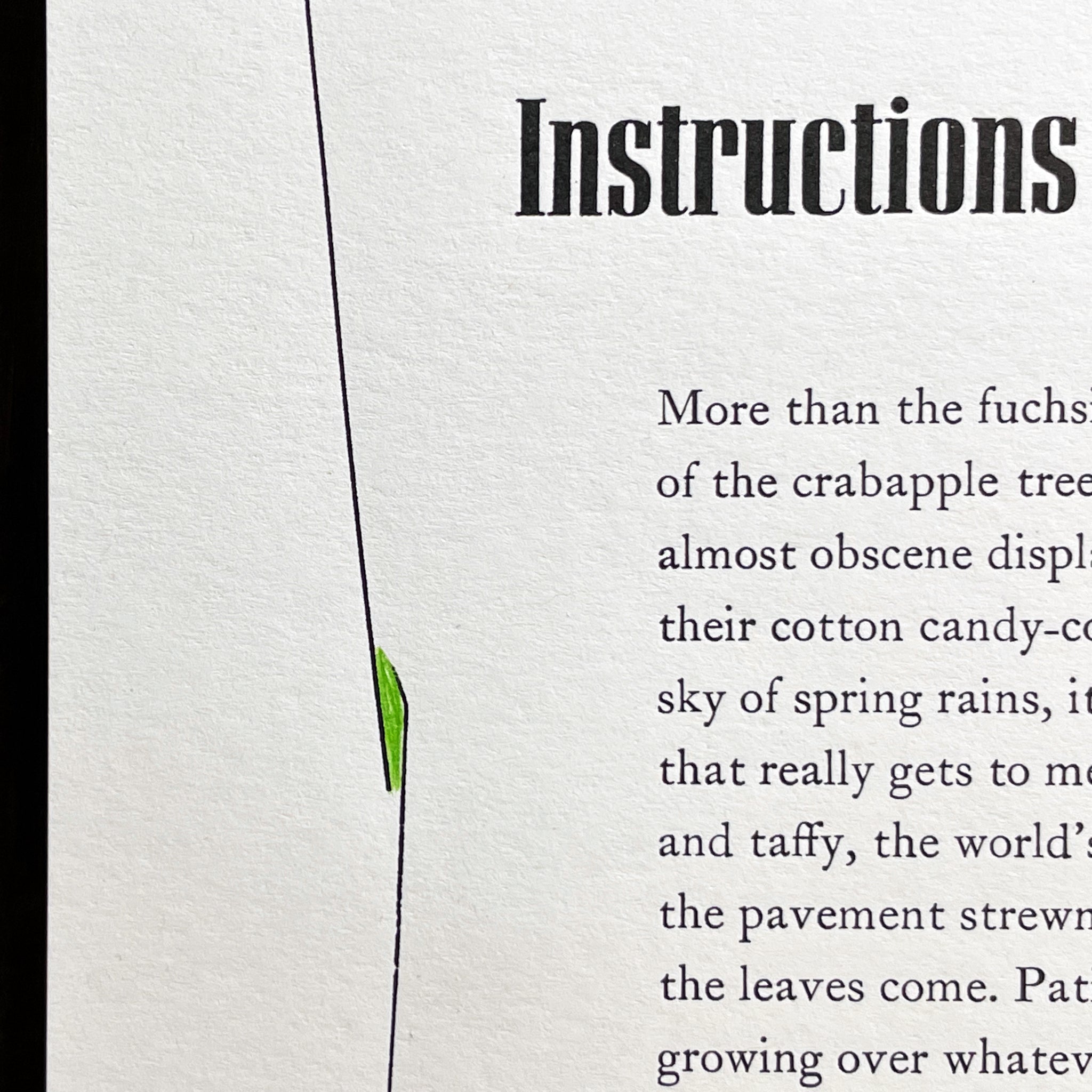
A year passed, I made many other things and traveled halfway around the world and back, and all the while the beginnings of this book took root in my imagination. For the longest time I had a strong image of a broken speckled egg for the front cover. It occurs to me now that the whole book is an egg to be broken open; the paper I chose for the cover is made from recycled content with subtle variegated flecks all over. There’s a single solitary feather drifting about, that could be from a live bird or a dead bird. It is suspended in mid-air and the slightest breath could determine its direction for good. It captures my feelings about the fate of our planet at large, which hangs in the balance of so many simple decisions made on a daily basis by individual people.
I received the final manuscript last October and commenced several months of hemming and hawing over the layout of the interior, a lot of worry about choosing the most appropriate digital typeface and careful deliberations over the long line length of the poems. Meanwhile decisions about the materials and edition size loomed, and I developed a marketing plan replete with press releases, prospectuses, scheduling readings, online ordering, wholesale discounts, publication announcements and on and on. It’s a constant process of hopping back and forth between the work that has to be done to tell the world about the book, and the work that has to be done to produce the actual book.
After seventeen rounds of proofing and about a hundred million typographic refinements and much nail biting, I sent the final files of the interior to be offset printed at my favorite local commercial shop, Bluesky Printing. Loren at Bluesky is exceedingly patient with my digital learning curve and exacting standards, and he is always amused when I break out my pica pole. Concurrent with the proofing process for the interior, I designed and printed the covers of the book with handset metal type and a found cut of a feather. I letterpress printed and scored the covers at Beans n’ Rice Creative Studios, my friend Sarah Kulfan’s shop in north Seattle, because they are too big to print on my current press. At the last minute I realized I didn’t have the right sorts for the spine tilting, and I ran across town to borrow a few lines of 10 pt Spartan Book from my good friend and stalwart type consultant, Amy Redmond of Amada Press. Even a one-woman shop like my own is never truly on her own, thank goodness!

Did I mention there are two editions? 375 trade copies, and 26 deluxe. Which means that throughout the process, every decision I made had to be made twice, considering two different sets of specifications and then some. Yes, I’m feeling tired just writing about it. Yikes!
So yes. Design design design, inside and out. All of the materials compared and tested and decided, then ordered. Giant parent sheets of paper cut down to useable sheet sizes. Then, finally, printing!
On to the Bindery
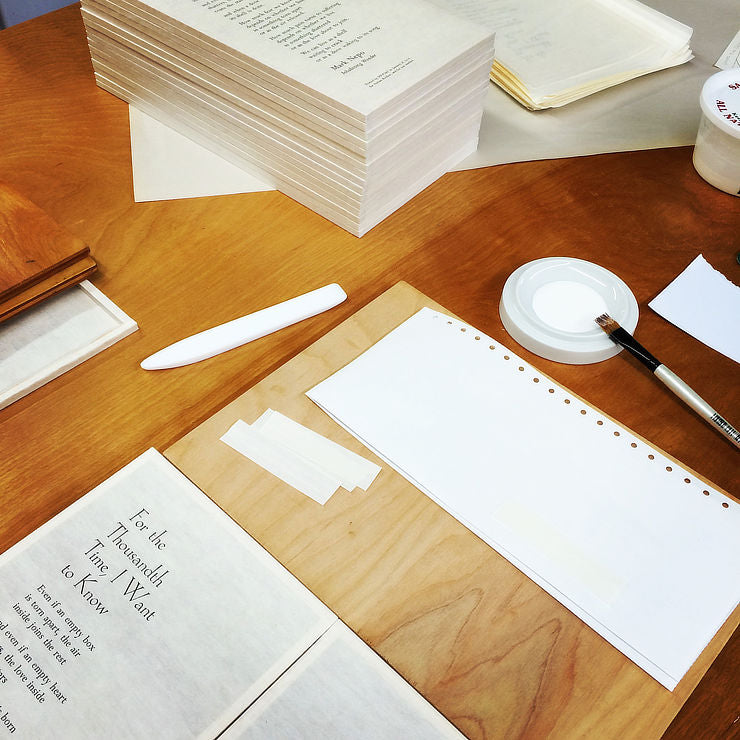
This is where I’m at in the process right now. Next up:
- folding the rest of the covers
- folding and collating the text blocks
- piercing and sewing the text blocks
- face-trimming the text blocks
- casing in (attaching the text blocks to the cover)
- folding and attaching the paper band (that has the blurbs and barcode)
For the deluxe edition, I need to do all of the above (minus the paper band) as well as:
- print and attach tiny spine labels
- cut down beautiful handmade Japanese paper (kozo)
- experiment & illustrate the kozo
- collate the text blocks with the kozo
- design and build archival slipcases
- sign and letter the edition
A lot of work? Yep. And somehow it’s all going to happen, and from the piles and piles of book parts strewn about my shop right now, there will emerge a beautiful and orderly stack of poetry books.
I love the poems. That’s why I’m able to do what I’m doing. I’m sure you’ll love them too.


