Embracing Grief
What I’m most grateful for about the losses I’ve experienced in my life is their effect of making me suddenly, unexpectedly, excruciatingly present.
The summer my older brother died I was painting a friend’s 2-story 4-bedroom house a soft pale yellow. I was about three quarters of the way through when the news came. All the prep work was done: power washing, scraping, sanding, caulking, priming. The first coat of the siding was done, second coat halfway. Scaffolding was up, ladder placements standardized, awkward corners all attended, trim decisions made, wasp nests sprayed out. Zero rain in the forecast. I was on a roll and set to finish inside of two weeks.
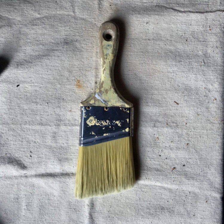
I remember the phone call from my mom, and I remember telling my youngest brother when I picked him up from kayak camp. I remember it was Friday, and the grass at the city park was very green. From there, everything blurs and blanks. There are several months I can’t properly account for. Except that yellow house slowly turning yellower, and the paintbrush in my hand: my favorite, a 2.5” short handled Corona. I climbed up on the roof every morning and painted till after the sun went down. Unable to speak or think, alone on the roof was a good place to be. I couldn’t manage the roller anymore, the bigger bucket, the ladder hook. Couldn’t bear a single efficiency.
And so I finished painting that entire house with one brush. Nine years later I can still feel the stoutness of it in the crook of my hand, the solid wood, the ferrule firmly gripped between all five of my fingertips. I can see the stiff bristles flexing and drawing the thick paint along those old boards, filling in and smoothing out every inconsistency, bridging each impossible moment to the next.
From caption to composition
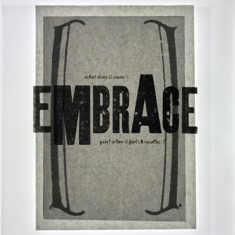
“What does it mean to embrace grief when it feels boundless?” I stumbled across this question a few weeks ago while struggling to come up with a response to the theme of “embrace” for this year’s Letterpress Workers International Summit. The words are from On Being, found on their instagram feed, a fleeting caption in a sea of distraction. They got me good. Sunk in and opened up a door right in the middle of me. I know the boundless feeling that loss engenders. Especially sudden loss. And isn’t all loss sudden, no matter what you “knew” to expect, no matter what you thought you saw coming.
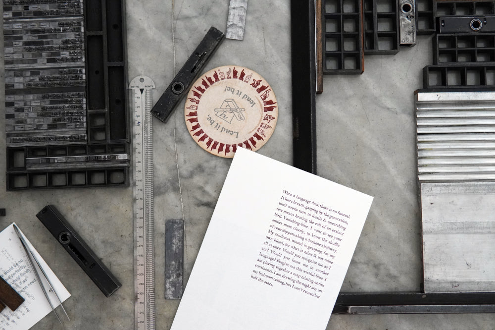
The design process for the Embrace print followed a number of unexpected turns. Up until the last moment, it was meant to be a layered, one-side piece, with the yellow brackets behind the words — as I am typing this, I realize that the yellow in the print is the same yellow of the house I was painting when my brother died. I had started with the type of course, that’s where I always start. The form came together in a snap and I was excited to print.
Color & image — out on a limb
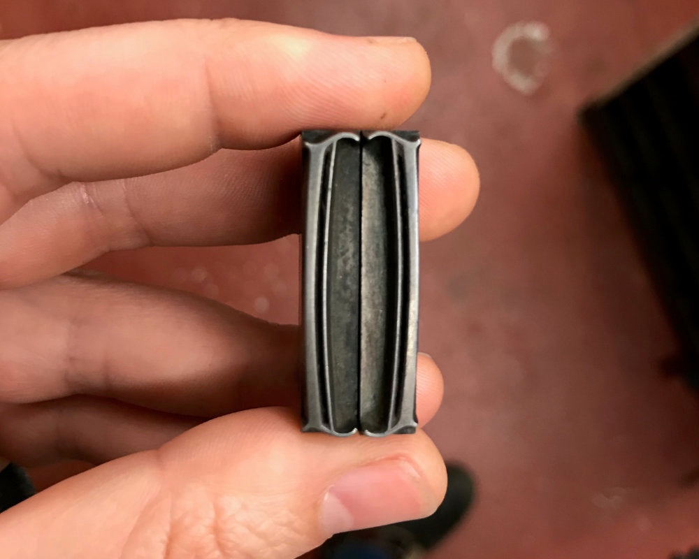
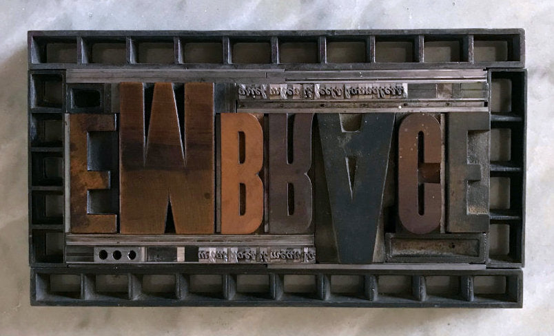
Adding the linocut with a transparent color was a suggestion from my friend Mike at Clawhammer Press, and it was too good an idea to not follow, regardless how far out of my comfort zone I’d have to go. I had been thinking about brackets already, and the double entendre of the word brace, both as a kind of support but also the gritting-teethness of it. I was loathe to draw (as I always am) but then I remembered this lonesome beautiful pair of brackets in my metal type collection.
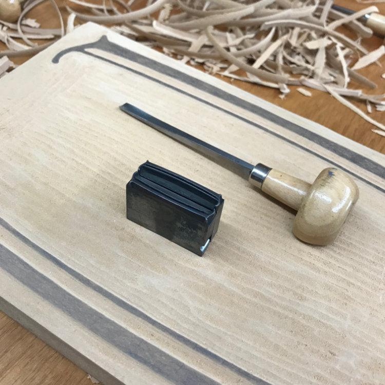
I pulled a quick proof of the original metal brackets, enlarged it by 500% or so on a photocopier, and used a light table to mockup the layout and test proportions. Then I traced the image, transferred it to a linoleum block, and carved it. I did that all in the space of an evening; hit a sweet zone-out spot and let the hours fly with my color worries drifting on by. Next day I stared at my ink shelf a long while before texting Mike for moral support. A true painter both on and off press with a masterful sense of color, he walked me through his process of mixing transparent-based wildly bright hues. After about twenty proofs, I achieved this light luminous yellow that amazed me the first time it came off press. I happily printed away all evening, filling sheet after sheet with those big warm brackets.
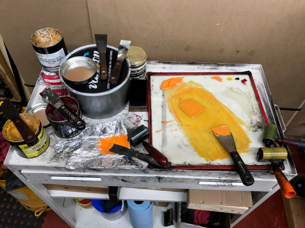
Another night of drying ink, another morning of endless emails. Come afternoon the following day, I set up for the second press run, the main type form. I was so pleased with the results of the day before I thought, what if the type was in a semi-transparent color too? Or, at least, what if it wasn’t just black, like I always do? So I started mixing more ink and soon every knife and every brayer in my shop was covered and another big pile of proofs was littering the feed table and I was feeling more and more frustrated. I went back to black, and it was better, but still not quite right. I stopped, took a walk, went to find food. Talked to a few neighbors, and they all said black, so I inked up the press when I got back. Dialed in registration, impression, ink levels, got 100% ready to print. And then, paused again.
Final feelings, back to the beginning
Something about the type on top of those brackets wasn’t quite right. It was a great image, and I loved the tension between the word EMBRACE breaking off the page with the bleed on either side, and the brackets pulling in, oppositely holding the space in the middle of the page. The idea was great. But the feeling didn’t read right. I hung up two proofs, one of the type by itself and one with the brackets behind, turned around, walked 10ft away and turned back to consider. I did what I always do when faced with a no-one-right-way design dilemma: I went back to the text. I read that question out loud again and again, back and forth, reading it off one proof and then the other. It only took a few minutes for the decision to become clear.
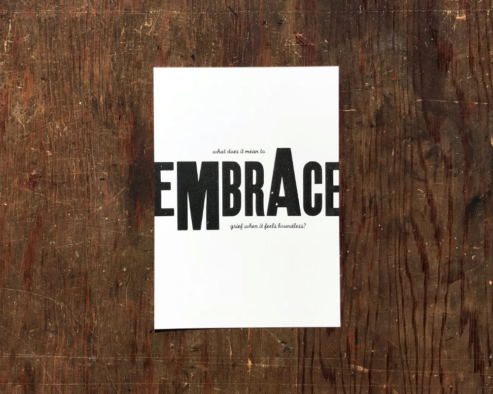
When grief feels boundless, that embrace isn’t there. Your loved ones may be all around but you can’t feel it. The world breaks open breathlessly, sharp, sudden, entire. The way I experience loss is how those letters are on the page: at once large loud off-kilter blaring, at once small secret unassuming. It’s hard to read them together. You lose the small script from far off, and by the time your eye’s focused in close enough, the big letters abstract and are lost to their parts.
But the embrace is always there. You only have to flip the page. Sometimes you can, sometimes you can’t. There’s no telling when. It happens in small ways and big ways, and over time it’s easier to accept and know where to find. Over time, each kindness breaks you less and bolsters you more.

PS — a big stack of these prints were shipped off to Italy, but I printed extra in case you need one. You can get one here.