Making “tó” by Sherwin Bitsui

“tó” was created in collaboration with the author to support the launch of the James Welch Prize for Indigenous Writers. It took a year of slow moments to design and print. Further evidence of a known fact: the “simplest” designs are the hardest.
Two moments stand out to me starkly from the process. First, a beautiful conversation with Sherwin where he explained that tó is the Diné (Navajo) word for water, leaving me with the soft sound of the word falling from his mouth and the image of a single yellow leaf drifting downward.

The second moment was a wild serendipity that made color a priority. This made more work for me but it was work I was glad to do given the wonder I felt and the clarity it induced. I always begin a design in black, and that is typically where I end up. Not because color disinterests me, but because I am more interested in language and form.
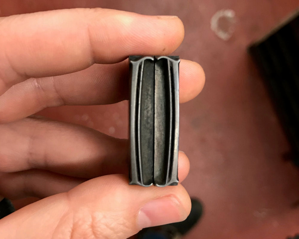
I mucked about with proofs and banged my head against technical issues for months, due to a larger format called for than my type could accommodate. The only italic o with an accute accent in my metal type collection is 9/10pt Caslon. Small! So I turned to digital type options where I am half as confident and twice as slow. Surprisingly, color ideas stayed with me strongly through every layout: yellow (leaf) and blue (water). I mentioned this to Sherwin and his response shocked me: “I don't know if this is relevant but the four sacred colors in Navajo are blue, yellow, jet, and white.”
Well. White was already there with the paper. I was debating between blue and black (jet) for the type. And the yellow kept drifting. I knew it would be printed on the Colt’s Armory Press due to size and it was a sweet moment I realized this allowed me to do a gradient as well — in one pass, I printed a subtle shift from deep blue to black, top to bottom. The final touch was Sherwin’s signature inked in yellow.
I am grateful to Sherwin for trusting me with his words, informing my process with kindness, and finishing it off with such grace.

Credits
Gratitude to Poetry Northwest (instigators of the James Welch Prize) for connecting us, and to Copper Canyon Press for permission to print.
Limited copies of this signed print are available for sale here.
The poem “tó“ is from Flood Song, Copper Canyon Press. Copyright 2009 Sherwin Bitsui. Get the book here.
The type is Bunyan Pro, a revival of Eric Gill’s Pilgrim, by Patrick Griffin at Canada Type.
Process Photos

Reflex blue and universal black inks on the mixing glass. These colors are straight from the can but I always loosen them up a bit on the glass regardless before they go on the press. I once had a dream I was endlessly mixing cake frosting on an ink glass like this, a memory mix I guess from my long lost catering days.

Adding two inks at once to the oscillating roller on the back of the ink train of the 1906 Colt’s Armory Press.

Blue and black ink fully milled in on press, to create gradient — a smooth blend of multiple colors able to be printed at once. Lots of platen presses can't do this given their round disk inking system, the Colt’s is extra special in this regard! Actually, in many regards. You can also see a test sheet of the Bitsui print on the platen of the press. This is a birds eye view taken while standing behind the press.

Mid press run on the 1906 Colt's Armory. Feed table on the right with blank paper ready to be fed; delivery stool to the left with slip sheets between layers of prints. Also on left is Mabel the shop dog doing her job. One of her Very Important Duties is to stay on her bed anytime a press is running and she does it very well.


